Graphic design is everywhere, from packaging to logo design to TV adverts to graphic panels – in our work the graphics are developed to communicate brand identities, museum content, and marketing messages and engage visitors in stories in imaginative ways. This week we go behind the scenes with our Graphic Designer, Phil Boardman, to discover more about his day-to-day life as a Senior Graphic Designer.
- What is your process for designing a brand identity for a museum?
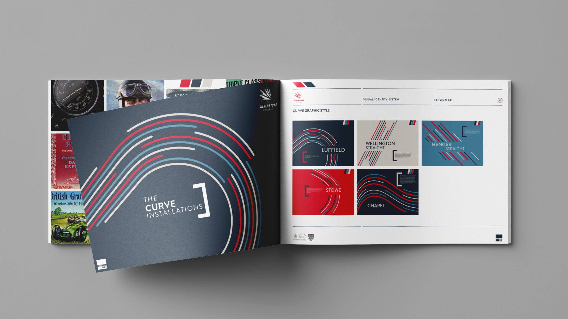
As a starting point, the key question is whether the company wants to keep the existing brand or create an entirely new one. Whichever way, it is about cementing an identity that is bespoke for them. The graphic styling, colours, fonts, etc. need to communicate their key values, messages and themes. This will then translate down to the exhibition spaces and across the media. Working with a museum is quite different to working with a corporate brand. With museums, there can be more of a story to work with in the visual style whilst with corporate clients a strong brand identity normally already exists that we need to stay faithful to.
- Is it challenging to incorporate both the client’s branding and your own ideas into your work?
Each client is different. Some clients are open to ideas and some already know exactly what they want and have a clear vision. I personally think it is important to take onboard all the client’s ideas but also bring some new ideas to the table. The client will be an expert in their industry, and they will understand what their audience wants, but they may not necessarily know how to present the graphics or stories – which is where my expertise comes in.
- How do you handle deadlines?
Every project is different. Some projects will have a very quick turnaround where deadlines will be intense, then on the other hand we have projects which take years to turn around. I try to look at what I need to do each day and prioritise the work – the worst thing a graphic designer can do is rush their work because of poor time management.
- As a graphic designer for Mather & Co, what does a typical day for you look like?
For example, say I was starting a brief for a new client – I would start by researching the topic, creating mood boards, then start looking at typography, colour, imagery – basically all the foundations of the identity. Each day is a great opportunity to approach designs with a fresh set of eyes.
- Which do you believe to be more powerful to an audience – 2D or 3D graphics and why?
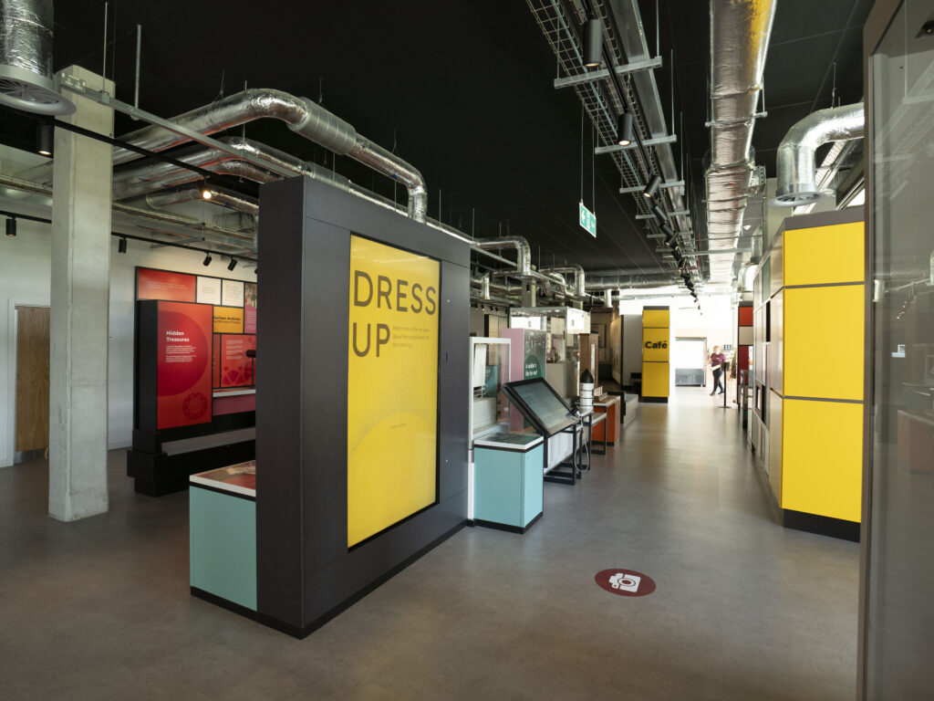
One image alone can be very powerful or alternatively you could have an amazing AV show or 3D structure which can have the same effect – either way both should complement each other in an exhibition space or any space for that matter. When graphic designing for a museum I think you need to consider how 3D sculptural, 2D graphics and AV seamlessly interlink. They all must work together in an experience.
- Where do you get inspiration from? Does this vary on each project?
When trying to get inspiration for museum graphic design, I look away from museums. I look at packaging or poster design and try to incorporate those ideas into a museum. This gives a different approach from another industry rather than just getting inspiration from what has already been done in a museum setting.
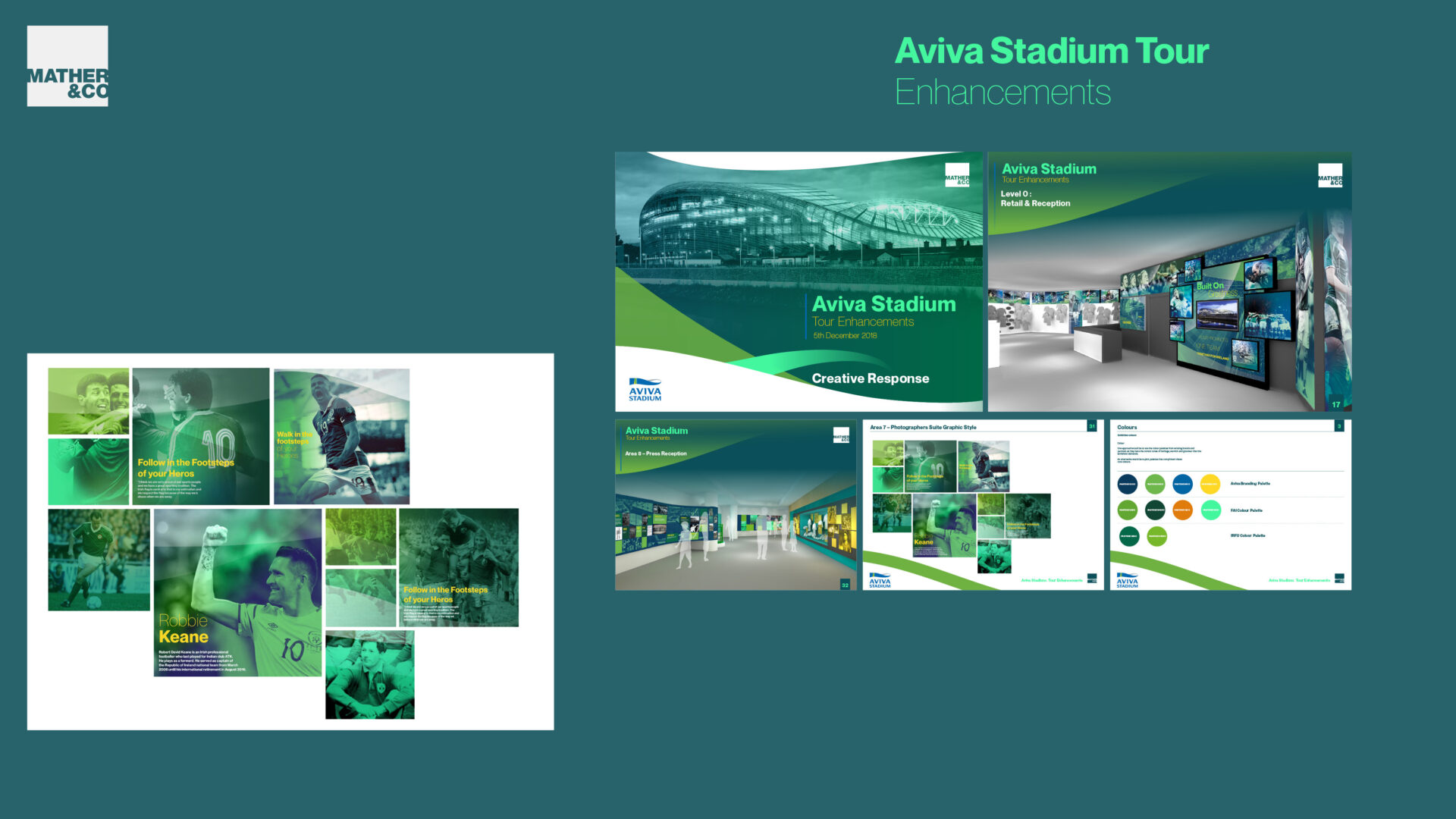
- What has been your favourite project to work on at Mather & Co and why?
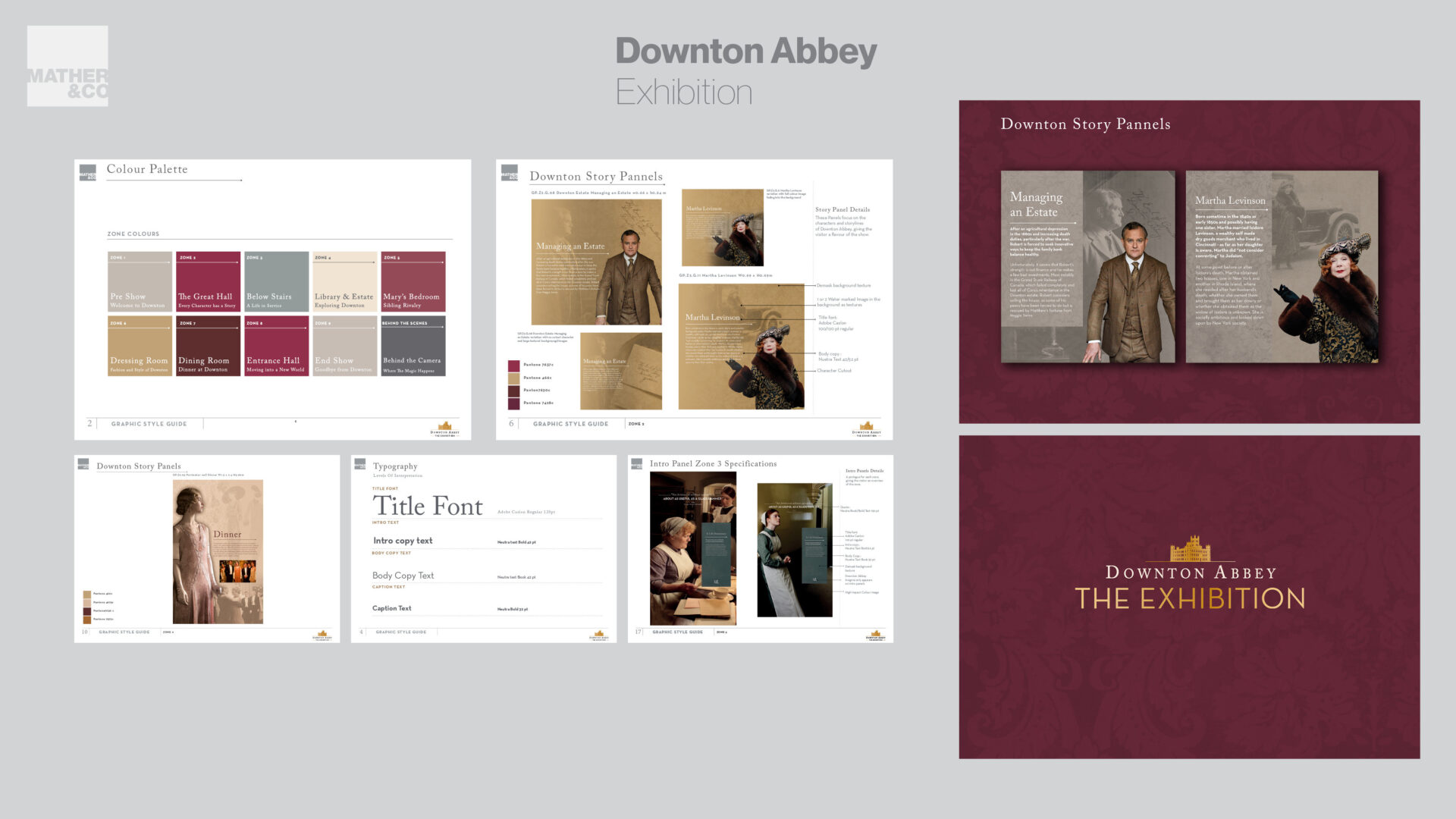
Personally, sports projects are my favourite as I hold a true interest in sport and its heritage. Paris-Saint-Germain History Room was one of my favourite projects. This exhibition includes a moving graphic timeline of the club’s key moments. Another one of my favourite projects, which is not sport, is Downton Abbey: The Exhibition. This was one of my first major projects with Mather & Co, so it was great to work on because of how high profile the brand is worldwide, but also very exciting as the client was Universal Studios!
